Helpful! Well, sometimes, and certainly in this case. Since I had already broken the "rule" of Wordless Wednesday I figured I'd go ahead and post this too.
I need your opinion. So all of you who just normally read my blog but never speak up, now's the time to do it!
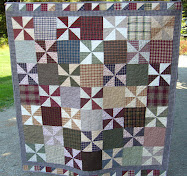
I'm putting together a new quilt and can't decided how I want to lay the blocks. I really like both of my options and am having trouble choosing. So, I'm soliciting your opinion on it.
I need your opinion. So all of you who just normally read my blog but never speak up, now's the time to do it!
I'm putting together a new quilt and can't decided how I want to lay the blocks. I really like both of my options and am having trouble choosing. So, I'm soliciting your opinion on it.
Will it be, Layout #1?

Or Layout #2?

You can let me know your choice by posting a comment! Thanks for helping!

.jpg)


21 comments:
I think I like #2 best but they are both nice. I think the multi-directional gives it more interest.
#2...I agree with Nancy and like that it's multi-directional.
I like #1. Love the stars.
Akiko, Oh my gosh, that is so funny, I didn't even see the stars!! I thought, "What stars?" and had to go back and change the way I looked at #1! How I missed that, I have no idea! Thanks!
#2. Because I still can't see the stars. Maybe I am more tired than I thought!!
I like # 2...I call them donuts...mmmm.
I like them both equally - sorry, no help!
I like #2, but I see x's not donuts!
My husband had to chime in- when I asked him which one he liked better he said, "I don't like either of them. It looks like linoleum flooring." He then said, "If I was making quilts, I sure wouldn't make that one." NICE honey. LOL
Tough call. I vote for 1
Pamela...look next to the x's and you will see the o's
Hi Heather, I like #2, but both are cute! Love you and miss you all, Leah
I like #2. It looks more organized to me...
I like layout #2! Lovely!
I love #1.
I like #2 and think you should ignore your husband.
I like these blocks better in number two. I think it will appeal to the masses who value symmetry.
Personally, number two is more dynamic, but with the neutral fabric of the corner triangles and the muted earth tones of the central part of the blocks, it is subdued.
I would add irregular sashing to it and make it an art quilt.
Or, machine applique something to some of all of the focus pieces.
But then, I make everything harder than it has to be. You can see some of my quilts on http://www.doublecatbatik.flikr.com
Tough call. If you are a traditional type person I would say #2. But #1 has a modern look to it.
For me personally #2
I like #2 better.
So, I guess I'm going with #2. Maybe I'll make the #1 design with some other fabric that I have. While I still like #1 just a tiny bit better, I do like #2 and I'm going to go with what appeals to the masses!!
Thank you so much to everyone who voiced their opinion! ♥
Number 2! It is more fun to look at.
Post a Comment